こちらはRainbowRunner144さんの有料スペースです。TradingViewから直接有料コンテンツにアクセスできるようになりました。有料スペースの詳細についてはこちら をご覧ください。 RT-Main Indicator The RT-Main Indicator is the core indicator that started it all. Developed over more than 5 years, this all in one tool helps traders identify when market participants are buying and selling using multi-colored candles that update in real time. It also identifies key support and resistance levels with Rainbow Pivots and highlights unusual price movements with Whale Print arrows. At its core, the RT-Main Indicator tracks buying and selling with eight colors instead of two, because real world markets are complex and order flow should not be treated as purely binary(Red vs Green).
Introduction
The RT-Main Indicator is designed as a primary Rainbow Theory Tool. It uses color coded candles to show changes in strength, Rainbow Pivots to mark important support and resistance areas, and Whale Prints to flag abnormal buy and sell activity. The goal is to bring these components together into a single framework so traders can read trend, structure, and larger player behavior without stacking many separate indicators.
This tutorial will cover each aspect of the tool:
Colored Candles
Whales are stealth experts and their strength is their ability to not be detected as they move the market. Rainbow Theory illuminates them from the shadows with a spectrum of specifically coded colors to display their unique strengths/weaknesses. In practice, this means the RT-Main Indicator uses internal strength and exhaustion metrics to color candles so that shifts in buying and selling pressure are easier to see.
The base of the RT-Main Indicator is the colored candles it paints onto the chart. These colors automatically tune to the chart based on the timeframe the trader is currently using (1D, H12, H1, 15M, etc). Instead of painting charts with a single Bullish Color (Green) and a single Bearish Color (Red), Rainbow Theory breaks out and identifies these moves into four Bearish Colors (Red|Orange|Yellow|White) and four Bullish Colors (Green|Blue|Purple|Pink). Each color tells a different story of the trend and helps traders better understand the nature of the current trend.
Bullish Colors
#4 - Green Candles - Weakest bullish color, these trends can sustain for extended periods of time.
#3 - Blue Candles - Strong bullish color, a move is starting to develop and can sustain.
#2 - Purple Candles - Second strongest bullish color, Whales are committed to the move but cannot sustain this level of momentum for long durations and a top is near.
#1 - Pink Candles - Strongest bullish color, Whales are using every single ounce of energy they have to push price up, the trend cannot be sustained and its time to take profits.
Bearish Colors
#4 - Red Candles - Weakest bearish color, these trends can sustain for extended periods of time.
#3 - Orange Candles - Strong bearish color, a move is starting to develop and can sustain.
#2 - Yellow Candles - Second strongest bearish color, Whales are committed to the move but cannot sustain this level of momentum for long durations and a bottom is near.
#1 - White Candles - Strongest bearish color, Whales are using every single ounce of energy they have to push price down into all out capitulation, the trend cannot be sustained and its time to look for entries.
How To Enable Colored Candles
By default, the Indicator’s Candles are placed behind the default candles. To properly display them, you must bring them forward. To do this, click the settings icon on the indicator, click visual order and then click bring to front:
Example - Bringing all the colors together into a Bearish Trend that reverses into a Bullish Trend:
The color thresholds can be tuned using the following options:
Automatic Tuning On/Off - Enables or disables the automatic color tuning that adjusts for each timeframe.
Auto Tuning Gain (Inc/Dec) - Increases or decreases how aggressive the automatic tuning algorithm adjusts color tuning.
Manual Fine Tuning - Linear Color Shift - Manually controls the linear sensitivity for color candle thresholds. This can be visualized as a setting being adjusted up or down in a straight, linear fashion. Linear Color Shift
Manual Fine Tuning - Exponential Color Shift - Manually controls the exponential sensitivity for color candle thresholds. This can be visualized as a setting being adjusted in an exponential manner where each level moves in an exponential shift instead of all moving equally. Exponential Color Shift Dark Mode
Some traders prefer light colored backgrounds for their charting, which can make white candles difficult to see. The RT-Main Indicator includes a Dark Mode toggle so colors stay readable on both dark and light charts.
Dark Mode Candles On/Off - Forces the indicator to use the second color set stored in the Style tab in the RT-Main Indicator settings when using light backgrounds. The White/Black Candle can also have a custom color applied if the trader is not content with these two default options.
Custom Candle Colors
In addition to toggling between light and dark modes, each individual color used by the RT-Main Indicator can be edited in the Style tab. This allows traders to keep the same logic while adjusting the visual palette to match their own chart layout.
Rainbow Rotations
Rainbow Rotations are a feature traders use to catch reversals or reversions when a trend fully blows out. The algorithm triggers on the first weaker candle that closes after a Pink or White candle prints. The general idea of this event is to show peaks and valleys of an asset.
In a strong bearish move, White candles mark extreme selling. If a weaker Yellow candle appears after a White candle, that first weaker candle is where the rotation event triggers and a Rainbow Rotation marker is placed on the chart. In a strong bullish move, Pink candles mark extreme buying. The first weaker bullish candle after a Pink candle triggers the opposite side rotation marker.
Note that Rainbow Rotations can only be visible for a finite amount of candles. The Replay function in TradingView can be used to review previous triggers.
Rainbow Rotation settings are available near the top of the settings menu:
Rainbow Rotation Alerts On/Off - Toggles these signals on or off with one click.
Rainbow Rotation Symbol - Customizes the symbol that is plotted on the chart for Rainbow Rotations. Both text and emojis can be used instead of the default symbol.
Rainbow Rotation Alerts
Rainbow Rotations can also be automated with standard TradingView alerts. To set this up:
Click the Alert icon on the right side of the screen.
Change Condition to the RT-Main Indicator.
Change the second condition to one of the three options:
Bullish Alerts | Bearish Alerts | Bearish and Bullish Alerts
Set Trigger to Once Per Bar Close.
Once set up, this allows traders to be notified when the RT-Main Indicator detects an extreme bullish or bearish trend that is starting to reverse.
Automated Pivots
One of the RT-Main Indicator's most powerful functions is the automated support and resistance pivots. This logic uses two internal bots that are tuned to look for potential support and resistance order blocks.
The Resistance Pivot Bot prints lines that are painted with red dashes.
The Support Pivot Bot prints lines that are painted with green dashes.
Regardless of the color of the dashed pivot line, any trend that approaches a pivot should be respected. For example, a trend moving up towards a green support pivot should still treat that area as resistance if price is approaching from below.
As the algorithm continues to print additional pivots on the chart, traders can start identifying order blocks that are otherwise hidden in the price action. These order blocks are key support and resistance areas that trends will often interact with and respect. Multiple stacked pivots in the same region are a visual clue that such an order block has formed.
Pivots can be tuned with the following options:
Pivot On/Off - Quickly toggles all pivots on or off.
Pivot Style - Switches between different styles of marking pivots.
Pivot Sensitivity (Inc/Dec) - Tunes the sensitivity of the pivot algorithms. Adjusting this changes how many pivots are printed on the chart.
Pivot Line Drawing Length - Controls how long the indicator draws the pivot lines.
Resistance / Support Pivot Colors - Allows customization of pivot colors to match the rest of the chart.
Whale Prints
One of the most important parts of the RT-Main Indicator is tracking Whale Prints. This portion of the script looks for abnormal buys and sells that are more consistent with large players than typical flow. Under normal circumstances, whales try to avoid being visible when they buy or sell, but there are times where they are forced to come out of hiding and deliberately move the market.
The Whale Print logic is tuned to notify the trader when it detects that this type of unusual activity may be occurring.
Bearish Whale Prints are marked on the chart with a red triangle.
Bullish Whale Prints are marked on the chart with a green triangle.
Whale Print clusters are situations where multiple Whale Prints have been identified in the past 10 candles. While individual Whale Prints are useful, clusters of Whale Prints are particularly important because they often signal that a very large move is potentially being prepared/defended.
The Whale Print table is an active tracker that counts the number of bullish and bearish Whale Prints that have occurred in the past 10 candles. Whale Print settings can be tuned with:
Whale Print Clusters Table On/Off - Toggles the Whale Print table on or off with one click.
Whale Print Clusters Alerts On/Off - Toggles the Whale Print cluster symbol on or off.
Whale Print Cluster Symbol - Changes the symbol on the chart for Whale Clusters. Emojis and text can both be used instead of the default symbol.
Whale Print Cluster Bullish/Bearish Label Color - Customizes the color of the Whale Print cluster labels on the chart. Whale Print Cluster Alerts
Whale Print Cluster alerts can be automated with standard TradingView alerts. To set this up:
Click the Alert icon on the right side of the screen.
Change Condition to the RT-Main Indicator.
Change the second condition to one of the two options:
Bull Whale Cluster Alert | Bear Whale Cluster Alert
Set Trigger to Once Per Bar Close. Once set up, this allows traders to be notified when the RT-Main Indicator detects a Whale Print Cluster.
Bull/Bear Trend Step Line
The inflection point of the colored candles is controlled by the Bull/Bear Trend Step Line. This is the grey stepped line on the chart where the bullish and bearish colors meet. Candles above this line are marked by the four bullish candle colors.
Candles below this line are marked by the four bearish candle colors.
The Bull/Bear Trend Step Line can be tuned with:
Bull/Bear Line Offset - Controls a vertical threshold for the line.
Bull/Bear Line Smoothness - Controls the sensitivity and smoothness of the line so traders can fine tune it for their specific setups. Most traders do not adjust the Bull/Bear Step Line. The small group that does typically only use these settings for lower timeframe trading setups below 5 minute candles. If preferred, the line can be recolored or hidden from the Style tab of the RT-Main Indicator without changing how the core color logic works.
Important Note
The RT-Main Indicator is intended to provide additional context around trend strength, exhaustion, and key areas of support and resistance. It is not a standalone signal generator and should always be used together with your own analysis, testing, and risk management. Historical color patterns, pivots, and Whale Prints do not guarantee future results.
🐋 Tight lines and happy trading! RT-Custom Clouds|RSI|HMA|GP Introduction
The RT-Custom Clouds|RSI|HMA|GP indicator is a multipurpose toolkit that combines custom Ichimoku clouds, custom RSI-based overlays, RSI Top/Bottom signals, Hull Moving Averages and automated Fibonacci Golden Pocket zones into a single indicator. It is designed to give traders flexible ways to view trend, momentum, and key zones on the chart.
This publication walks through each major component of the RT-Custom Clouds|RSI|HMA|GP indicator and how traders commonly use them.
Custom Ichimoku Clouds
The top section of RT Custom Clouds focuses on Ichimoku-style clouds. Traders can choose between different cloud variants and control whether they want the full Ichimoku toolkit or only the cloud itself on the chart.
A single toggle controls the cloud display: Cloud Only (All Versions) - When enabled, only the selected cloud is displayed. Core Ichimoku lines are hidden so traders who prefer a clean cloud view can keep their charts simple. Traders can select between three cloud styles: Josh Olszewicz Cloud (Preferred) - Uses a doubled parameter set inspired by the well-known Ichimoku variant popularized by Josh Olszewicz.
Standard Cloud - Uses the classic Ichimoku settings familiar from most charting platforms.
Custom Cloud - Allows full control over the main Ichimoku inputs:
Custom Conversion Line Length
Custom Base Line Length
Custom Leading Span Length
Custom Displacement
These options let traders move between a standard Ichimoku view, a doubled parameter variant, or a fully customized configuration tuned to their own style.
Custom RSI X's and RSI Bot Signals
The RT-Custom Clouds|RSI|HMA|GP indicator also includes an RSI X overlay that plots RSI information directly onto price candles instead of keeping it in a separate lower pane. This makes it easier to see momentum shifts and extended conditions without constantly looking down at another indicator. RSI Colors
Instead of drawing RSI as a line, the tool places colored X markers on candles to reflect RSI behavior. These markers use an adapted version of the Rainbow Trends color system. To keep candle colors and RSI markers visually distinct, the original Rainbow Trends color code is inverted for RSI. This inversion helps traders quickly distinguish between the underlying trend colors and the RSI-driven overlays: RSI Settings
The RSI section includes a focused set of options to tune how the X markers behave and how the RSI Bot interprets momentum:
RSI "X" Marker Sensitivity - Adjusts how sensitive the X markers are to RSI changes. Higher or lower values will change how often markers appear.
RSI Length - Controls how many candles are used when calculating RSI. The default value is similar to traditional 14-period RSI, but can be adjusted.
RSI Markers On/Off - Toggles the colored X markers on or off.
RSI Top/Bottom Signals On/Off - Toggles the RSI Bot signals that mark potential tops and bottoms.
RSI Overbought On/Off - Enables or disables overbought style X markers.
RSI Oversold On/Off - Enables or disables oversold style X markers.
RSI Bot - Tops And Bottoms
Over time, traders using this tool wanted a way to summarize longer stretches of RSI activity into clear signals. The RSI Top/Bottom Bot does this by watching runs of RSI X markers and waiting for those runs to pause.
Conceptually, the RSI Bot: Monitors when a strong sequence of RSI X markers is printing in one direction.
Waits for a candle where no RSI X marker appears after that run.
Marks that candle as a potential RSI Top or RSI Bottom, since the prior RSI pressure has paused and a reversal may start. These signals can be tied to TradingView alerts using standard alert conditions so traders can monitor major shifts in RSI behavior without watching every bar. Alerts can be set for either RSI Top signals or RSI Bottom signals. Hull Moving Average (HMA)
The RT-Custom Clouds|RSI|HMA|GP indicator also includes a Hull Moving Average component inspired by early users of Rainbow Trends tools who relied on tuned HMAs for trend context. The HMA implementation follows common definitions of the Hull Moving Average and can be configured with user-defined lengths. Many traders using this tool treat the HMA as a secondary trend filter or confirmation layer alongside other Rainbow Trends indicators. For example: Watching whether price is trading above or below a longer HMA to frame bullish or bearish bias.
Studying how price interacts with the HMA during extended trends or range rotations.
HMA Cross Alerts And Divergences
The tool can also draw and alert on HMA cross events and divergence style patterns: HMA Cross Alerts - Alerts can be configured when price or multiple HMAs cross, allowing traders to automate notifications for potential trend shifts.
HMA Divergences - An optional divergence mode looks for conditions similar to RSI divergence style setups, but applied to the HMA logic. These are intended as context layers around trend behavior, not as automatic entry and exit rules.
HMA Settings
The HMA module of this indicator can be tuned to meet each trader's preference.
Plot HMA - On/Off - Toggles the HMA Line on/off.
HMA Alerts - On/Off - Toggles HMA Alerts on/off.
Plot HMA Alerts - On/Off - Toggles HMA Alerts on/off.
Plot Divergences - On/Off - Toggles Divergences on/off so the trader can choose which specific ones they want to display.
HMA Period - Adjusts the period of candles the HMA is calculated off of.
HMA Source - Changes the base calculation of the HMA.
Pivot Lookbacks - Adjusts the candle lookback range for the HMA Divergences.
Max/Min of Lookback Range - Adjusts the min & max lookback range for the HMA Divergences. Fibonacci Golden Pockets
The RT-Custom Clouds|RSI|HMA|GP indicator also includes an automated Fibonacci Golden Pocket module. Instead of manually drawing Fibonacci retracements and marking the Golden Pocket region for each swing, the tool scans the chart and plots these zones for the trader.
The Golden Pocket module can be configured using:
Golden Pocket On/Off - Toggles automatic plotting of golden pocket zones.
Golden Pocket Colors - Controls line and fill appearance so zones can be made more or less prominent.
Lookback Period - Defines how far back the algorithm studies price action when searching for swings and drawing golden pocket zones.
Invert Fibs - Inverts the Golden Pocket measurement.
Extend Lines - Allows for the Fib lines to be plotted further across the chart.
Display Prices/Levels - Toggles plotting of the prices and Fib levels on and off. Some traders prefer to work with both traditional and inverted golden pockets at the same time. This can be done by adding RT Custom Clouds to the chart twice, running one instance with standard golden pocket settings and the second instance with inverted settings.
How Traders Commonly Use The RT-Custom Clouds|RSI|HMA|GP Indicator
Because the RT-Custom Clouds|RSI|HMA|GP indicator offers several tools into a single script, traders often use it as a multipurpose context layer rather than a one-dimensional indicator. Common patterns include: Using custom Ichimoku clouds to frame overall trend and support or resistance zones.
Overlaying RSI X markers and RSI Top/Bottom signals onto price to highlight momentum shifts and exhaustion areas.
Adding HMA and HMA cross alerts as a secondary trend confirmation tool.
Letting the Golden Pocket module continuously plot Fibonacci based zones to study how price reacts around them over time.
In all cases, RT Custom Clouds is designed to provide structured context that can be combined with other Rainbow Trends tools, price action, and volume analysis.
Important Note
The RT-Custom Clouds|RSI|HMA|GP indicator is intended to provide additional context around trend structure, momentum, and potential support or resistance zones. It is not a standalone signal generator and should always be used together with your own analysis, testing, and risk management. Historical examples or past interactions with clouds, RSI markers, HMAs, or golden pockets do not guarantee future results.
🐋 Tight lines and happy trading! RT-Machine Learning Reversion Bands Machine Learning Reversion Bands is a support and resistance tool designed to highlight where trends have historically reverted and where price is pushing into unusually extreme territory. It plots two sets of bands around price so traders can see both standard reversion zones and more extreme, machine learning levels that adapt and learn from the chart over time.
Introduction
The Machine Learning Reversion Bands tool utilizes an algorithm that learns from the chart’s full visible history. Instead of manually scanning through years of candles, the script studies the data and builds machine learning bands that respond to how the asset has actually behaved over time.
This version retains the original red and green Reversion Bands and adds a second set of dynamic Machine Learning Bands that adapt to volatility. This gives the trader four levels to reference: Red and Green Reversion Bands for more traditional support and resistance reversion zones.
Cyan and Orange Machine Learning Bands that adapt as new extremes form on the chart. The red and green bands are tuned for more typical reversion behavior, while the cyan and orange bands are focused on those moves where price stretches beyond its usual range. This can help frame potential entries, exits, and risk around both normal and more extreme conditions.
Support Versus Resistance
Machine Learning Reversion Bands tracks four main levels of support and resistance:
Green and Red Bands - Standard Reversion Bands
These bands mark more common reversion points for many assets. They highlight areas where trends have historically run into exhaustion and reverted back toward the mean. When price approaches these zones, it is often interacting with regions where prior swings have slowed, paused, or reversed.
Cyan and Orange Bands - Machine Learning Reversion Bands
The cyan and orange band algorithm studies the asset by looking back at every candle that is available on the chart (as far as the user can scroll left). If there is a decade of data, the algorithm will use that full decade to learn how the asset has behaved in the past and then project where these cyan and orange bands should be overlaid.
In short, these ML bands give traders a view of where the tool estimates the more extreme extensions of a trend may be, based on historical behavior. In many cases, price will only touch the cyan and orange bands when it is moving into unusually strong or weak levels relative to its own past. Each time trends reach these orange or cyan levels, the tool updates from that price action so that its future projections continue to reflect what has already been seen.
A historical example of the cyan bands adapting to extreme bullish behavior on a DOGE chart.
A historical example of the cyan bands projecting resistance levels in an extremely bullish trend.
A historical example of the orange bands adapting to an EOS chart.
A second historical example of the orange bands adapting to a Ford chart.
Example Charts
The following examples show how price has interacted with the bands in specific historical periods. They are intended as illustrations of behavior, not as performance guarantees:
Tron - H4 - TRXUSDT - December 2024
Nvidia - H4 - NVDA - March 2020 Tesla - H4 - TSLA - April 2022 These historical example charts can be used to visually review how price has interacted with the bands in the past. They are illustrations of behavior, not performance statistics.
Settings and Tuning
Reversion Alert Markers are used to visualize when price is interacting with the bands and to help traders monitor potential reversion events. When enabled, these markers plot whenever price meets the internal conditions for a reversion touch inside one of the bands.
These markers can be toggled on and off in the settings of the tool. The markers can also be set to custom text/emojis per the trader's preferences:
The Bands can also be adjusted manually to fine tune the chart specifically to the asset that the trader is buying/selling: Smoothness Adjuster - Adjusts how sensitive the Bands are to price action.
Top Bands Height Adjuster - Adjusts the vertical height of the Upper Bands.
Bottom Bands Height Adjuster - Adjusts the vertical height of the Lower Bands. The Bands themselves can also be adjusted visually to suit each trader's preference. The borders of the Reversion Bands as well as the shading of the Reversion Bands themselves can be adjusted to be brighter or darker by adjusting these two settings:
Band Transparency Adjuster - Adjusts the opacity of the Reversion Bands.
Border Transparency Adjuster - Adjusts the opacity/brightness of the Borders that are drawn around the Bands. Example of the Reversion Bands and the Borders being set to be extremely bright: Example of the Reversion Bands and Borders set to be more transparent: The colors of the Bands and Borders can also be adjusted to meet the preferences of the trader. Below you can see each Band color being adjusted: Candle Filtering is an advanced tuning option that traders can use to enable the Reversion Alert Markers to only trigger during extreme price action movements that are tracked using the RT-Main Indicator.
Below is an example of Reversion Alert Markers operating in conjunction with the Colored Candles of the RT-Main Indicator running the default settings. By default, every candle color will trigger an Alert Marker when inside the Reversion Bands:
With Candle Filtering options enabled, the trader can set their chart to only display Alert Markers for White and Pink Candles that print from the RT-Main Indicator inside the Reversion Bands: For traders that utilize custom tunes on the RT-Main Indicator, the Reversion Bands Tool also has settings that can be used to bring the Pink/White Candle Filtering in synch with custom Candle Settings of the RT-Main Indicator:
Alert Automation
When setting up alerts for this tool, traders generally follow these parameters: 1st Condition - Select the RT-Machine Learning Reversion Bands Indicator.
2nd Condition - Select the desired alert condition that you want to monitor:
Entering Green Band | Cyan Band | Red Band | Orange Band.
Interval - Select Same as Chart.
Trigger - Select Once Per Bar Close.
This approach allows the tool to serve as a visual and alert-based context layer for potential reversion areas, while entries, exits, and order execution remain under the trader's control.
How Traders Commonly Use The Bands
Some common ways traders incorporate Machine Learning Reversion Bands into their workflow include:
Using the Green and Red Bands as reference points for more "typical" mean reversion areas within an ongoing trend.
Watching the Cyan and Orange Bands for rare extensions that may mark areas of extreme strength or weakness relative to the asset's historical behavior.
Combining Band touches with other tools such as RT-Main Indicator, pivots, or volume context to build confluence around potential trade locations.
Reviewing past behavior in Replay mode to see how different assets have reacted to Band touches during various market regimes.
The tool is designed to act as a support and resistance map that adapts to each asset's history, rather than a rigid rule set.
What Makes This Tool Different
While many indicators draw static channels or volatility bands, Machine Learning Reversion Bands are designed to:
Retain the familiar behavior of the classic Red and Green Reversion Bands while adding a second Machine Learning layer.
Learn from all available chart history to estimate where more extreme extensions have historically occurred in the past.
Provide four distinct Band levels so traders can distinguish between normal reversion zones and more unusual extremes.
Offer optional markers and alert integration so reversion interactions can be tracked without watching every candle.
Important Note
Machine Learning Reversion Bands are intended to provide additional context around support, resistance, and potential mean reversion zones. They are not a standalone signal generator and should always be used together with your own analysis, testing, and risk management. Historical interactions with the Bands, including any back-test style examples, do not guarantee future results.
🐋 Tight lines and happy trading! RT-Split Volume Split Volume is a volume analytics tool that separates estimated buy and sell volume for each bar, highlights abnormal activity, and makes it easier to see when larger participants may be stepping in or out of the market.
Split Volume Introduction
Traditional volume tools only show you the data for the candle that "won". This leaves traders in the dark about the balance between buying and selling behind each bar. Often a candle close is a photo finish between bulls and bears, and other times it is hardly a battle at all.
The Split Volume Indicator looks at both sides of the flow and identifies which volume candles have been flagged as anomalies compared with the surrounding volume bars. It is designed to provide additional context around where and how volume is flowing, rather than only showing total volume per candle.
Traditional Volume vs Split Volume
While volume is one of the most important signals a trader can watch, traditional volume indicators only show a single bar for each candle. Only looking at one side of the story puts the trader at a disadvantage. Sometimes the battle between the bears and the bulls is a photo finish, and sometimes it is hardly a battle at all.
In the comparison chart below, the middle pane shows TradingView's built in Volume indicator, while the lower pane shows Split Volume, so you can compare a single bar view with the split buy and sell view side by side.
Split Volume estimates buy and sell pressure separately and plots them on different halves of the panel. This gives a clearer picture of what is actually happening in the underlying order flow, not just which side closed the bar.
How Split Volume Works
The Split Volume Indicator uses an algorithm to estimate the buy and sell volume for each candle. All of the estimated buy volume is placed on the upper half of the indicator, while all of the estimated sell volume is placed on the lower half of the indicator.
As the bulls and bears trade back and forth on each candle, the algorithm also calculates a baseline average of the volume being traded over a rolling window. This dynamic baseline is shown by the gray Ghost Line.
When either the buy side or the sell side volume spikes well above that Ghost Line, the corresponding bars are flagged as abnormal. These abnormal spikes are color coded so they stand out against normal background activity.
Volume Candle Types
Green volume candles - Normal buying volume above the midline.
Blue volume candles - Abnormal buying volume above the Ghost Line.
Red volume candles - Normal selling volume below the midline.
Yellow volume candles - Abnormal selling volume below the Ghost Line.
Volume Impulses
One key pattern to watch with Split Volume is volume impulses: short bursts of concentrated activity that stand out from the Ghost Line baseline. These can be easy to miss with standard volume bars but become very obvious when normal and abnormal buy and sell flows are separated.
Settings
Volume in USD toggle On/Off - Switch between volume being displayed in USD or in the number of units (stocks or tokens) being traded. This change is reflected on the Y axis of the indicator.
Volume smoother - Changes the smoothness setting of the Ghost Line. Higher values make the baseline slower and smoother, and lower values make it more responsive to recent changes in activity.
Volume displacement shifter - Adjusts the vertical height of the Ghost Line. This lets traders control where they want abnormal blue and yellow volume candles to start triggering.
What Makes This Tool Different
Separates estimated buy and sell volume into their own zones instead of showing a single undifferentiated volume bar.
Uses a dynamic Ghost Line baseline so spikes are judged relative to recent activity, not a fixed threshold.
Highlights abnormal volume with clear color coding, making it easier to see when activity is concentrated on one side of the tape.
Emphasizes volume impulses and clusters that can precede or accompany larger moves, rather than only tracking total daily or session volume.
This indicator is intended to provide additional context around order flow and volume behavior. It is not a standalone signal generator and should always be used together with your own analysis, risk management and trading plan. Historical volume patterns do not guarantee future results.
🐋 Tight lines and happy trading!
RT-Mali Pivots & STD Liquidation Levels Introduction
The Mali Pivots indicator is a tool that is able to highlight support and resistance levels in relation to the 9,10,11,12,13 and extended Mali Counts of the trending price action. While numerous traders trade these counts, this tool is unique in that it continues counting past these base levels and will mark extended runs coming to an end with a vertical Red or Green Column.
The indicator identifies levels based on both 9,10,11,12,13 and extended Mali Counts, but splits them into both Support and Resistance levels and marks each level with a horizontal pivot. The level being Support/Resistance can be determined by the colors of the pivot. In addition, note that these pivot styles and colors can be edited in the tool settings.
How It Works
This calculation is based on the value of the current close compared to the close that happened four candles back.
MaliCount:= close > close When this condition is true for 9,10,11,12 or 13 consecutive closes in a row, the indicator will mark the candle with the current number count as well as drawing a horizontal pivot to indicate the importance of the Mali Count price levels.
When a count reaches important thresholds for the Mali Count, the indicator will: Label the candle with the current Mali Count.
Draw a horizontal pivot at those important Mali Count price levels.
Mark extended runs with a vertical red or green column when trends keep pushing beyond the minimum Mali Counts. The result is a visual map of where prior trend Mali Counts have completed and where price has historically reacted in the past. These levels are not trade signals by themselves, but they can be used as context when planning entries, exits, and risk.
Patterns of Mali Counts
At the core of the Mali Pivots Indicator is a tool that counts candles of a trend. Conceptually, it: Compares the current close to the close a few candles back to determine if the trend is still pressing in the same direction.
Increments an internal Mali Count as long as the trend condition continues.
Resets the Mali Count when the condition fails.
When the Mali Count reaches the minimum consecutive qualifying closes, the indicator marks that candle with the Mali Count number and establishes a pivot on the important price levels. Because up and down trends are tracked separately, traders can see both bullish and bearish runs and where they completed. Pivots
Each completed important Mali Count leaves behind a horizontal pivot that acts as a reference level on the chart. These pivots are split into support and resistance: Bullish Mali Counts leave pivots that often behave as support when price trades back into them from above.
Bearish Mali Counts leave pivots that often behave as resistance when price trades back into them from below. Pivot colors indicate whether the level is currently treated as support or resistance, and these colors can be adjusted in the settings to match the trader’s chart style.
Extended Trends Ending and Exhaustion
One of the unique aspects of Mali Pivots is that it continues counting beyond the typical 9,10,11,12 and 13 thresholds. When a trend keeps running and the internal Mali Count reaches extended levels, the indicator can highlight that area with a vertical red or green column.
These extended markers are designed to draw attention to trend legs that have pushed well beyond the usual Mali Counts. In many cases, these zones coincide with areas where trends begin to stall, consolidate, or reverse, but they should still be treated as context rather than automatic reversal signals.
Scalp Trading Zone
Some traders use Mali Pivots to frame shorter term trades between nearby support and resistance pivots. On example charts, this is sometimes called a “scalp trading zone” where: Active support and resistance pivots outline a defined price range.
Traders can study how price reacts inside that zone before deciding if they want to participate. This is an optional usage pattern meant for review and study. The indicator itself does not define specific scalp entry or exit rules. Settings
Mali Pivots Indicator includes a focused set of settings so traders can tune its visuals to their own charts:
Standard Liquidation Levels
- Liquidations On/Off - Toggles the tool on and off.
- Dark Mode On/Off - Allows users to use settings for light/dark backgrounds.
Mali Pivots - General Settings
- Pivots Toggle - Toggles the Mali Pivots on and off.
- Candle Color Toggle - Toggles the Candle Marker on and off.
Mali Pivots - Mali Count Settings
- 9/10/11/12/13 Number Toggle - Allows traders to turn off and on specific number displays on their chart.
Mali Pivots - Extended Run Exhaustion
- Extended Bearish/Bullish Trend Stop Toggle - Allows traders to control which extended run markers they want displayed on their chart.
Mali Pivots - Color Settings
- All Color Options - Allows traders to customize the coloring of the tool to match their specific requirements.
How Traders Commonly Use Mali Pivots Tracking where important Mali Counts have completed in the past and how price reacts when it revisits those levels.
Using pivots and extended columns as context when combining Mali Pivots with other tools such as RT-Main Indicator, volume, or broader market structure.
Reviewing historical Mali Counts in Replay mode to better understand how different assets behave around completed Mali Counts and extended runs. In all cases, the Mali Pivots Indicator is designed to highlight structure and potential exhaustion zones, while trade execution remains at the trader’s discretion.
What Makes This Tool Different
Mali Pivots differs from simple counting tools in a few key ways: It tracks both the standard Mali Counts and extended Mali Counts that continue beyond the normal levels.
It converts Mali Count completions into horizontal pivots that can act as long lived support or resistance references.
It visually distinguishes extended trends with vertical columns so unusual runs are easy to spot on the chart. Standard Liquidation Levels
This indicator also includes a simple liquidation level tool that projects where potential Longs and Shorts are vulnerable to being liquidated. This tool measures the base of the volume in the displayed candles and projects the following levels:
5X Liquidation Level - Longs & Shorts
10X Liquidation Level - Longs & Shorts
25X Liquidation Level - Longs & Shorts
50X Liquidation Level - Longs & Shorts
Important Note
Mali Pivots and Standard Liquidation Levels are intended to provide additional context around the trend's Mali Counts, support, and resistance. It is not a standalone signal generator and should always be used together with your own analysis, testing, and risk management. Historical trends and pivot reactions do not guarantee future results.
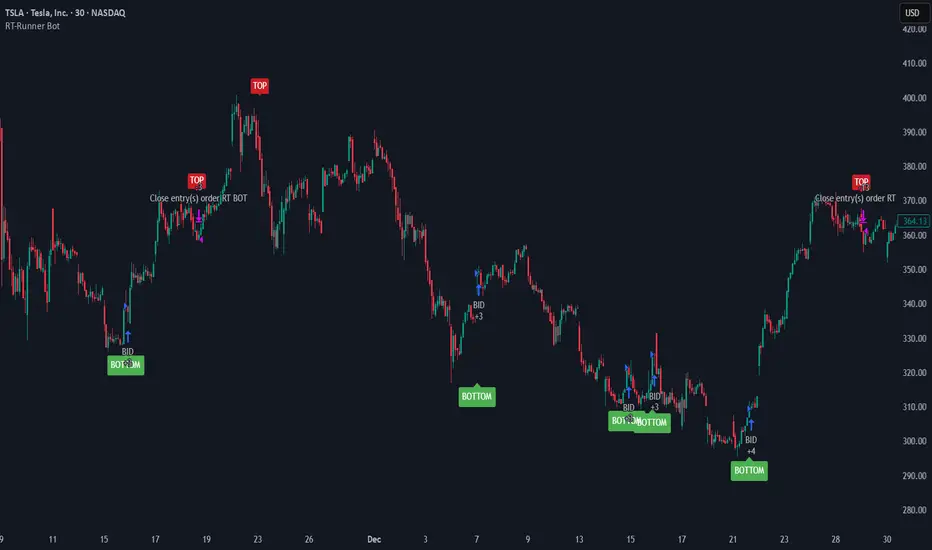
🐋 Tight lines and happy trading! RT-Runner Bot Runner Bot is a trend following tool designed to highlight when price shifts from normal back and forth rotation into stronger directional moves. It is built to help traders focus on higher quality trend legs, stay patient during chop, and avoid forcing trades when conditions are not aligned.
Blurring The Lines - Indicator vs Bot
Rainbow Trends set out to combine some of the ideas behind automated trading bots with the flexibility of trading indicators. After years of development, Runner Bot was built as an "indicator bot" that can be applied across multiple assets and multiple timeframes from the same interface.
How It Works
This tool aims to identify points where large market players - the "whales" - may be more likely to reverse the trend. It generates BOTTOM signals when its conditions suggest a potential market bottom has formed, and TOP signals when it detects that a potential top has been reached.
These signals are plotted directly on the chart so traders can visually review where Runner Bot has flagged prior tops and bottoms and compare them with their own levels, structure, and risk management.
How It Changes With Timeframe
Runner Bot identifies trend reversals based on the selected timeframe. The same logic can be applied across intraday, swing, and macro views, but its behavior will naturally change:
For macro level reversals, many traders focus on higher timeframes such as H4 to H12.
If you are scalping, you can switch to much lower timeframes, but keep in mind that bottoms detected on shorter intervals are less reliable at predicting a true long term bottom.
Choosing the timeframe intentionally is important: higher timeframes tend to highlight larger structural tops and bottoms, while lower timeframes are more sensitive to short term noise.
Tuning The Bot
Runner Bot was built to be relatively turnkey, but it does allow users to tune it for specific timeframes and assets.
To adjust the sensitivity of the TOP/BOTTOM prints, adjust the first two values in the settings column:
Decreasing these values (negative adjustments) will generally increase the number of TOP/BOTTOM signals the bot will fire.
Increasing these values will do the opposite and make TOP/BOTTOM signals less common.
This lets traders decide whether they want Runner Bot to be more selective (fewer, higher conviction style signals) or more frequent (more signals for active traders).
The trader also has the option to toggle the signals On/Off as desired. Some traders prefer to only plot TOPs and not BOTTOMs, or only BOTTOMs and not TOPs, depending on their strategy.
Limitations Of The Tool
Under the hood, Runner Bot uses internal algorithms working together to analyze price action. It can be applied across multiple timeframes, but like any tool, it has its sweet spots:
On higher ranges like 12H to 1D, you will mostly see TOP signals, which can be useful for monitoring extended moves.
On ultra low timeframes under 15 minutes, market noise can increase and short term bottoms are less reliable as long term turning points.
Fine tuning your settings to match your strategy, asset, and timeframe is recommended rather than relying on one configuration for every situation.
Preferred Settings
Over time, a few configurations have become common starting points:
H4 - A core timeframe to start catching both Tops and Bottoms across TradFi, Crypto, and Commodities.
H2/H4 Combo - Monitoring Bottoms on H2 and taking profits on H4 has been a popular combination among Rainbow Theory traders. H2 can provide earlier entries, while H4 offers a more conservative, lagging exit.
1D/H24 - Helpful for macro Tops in both TradFi and Crypto when combined with other higher timeframe context.
These are not rules, but practical examples of how some traders choose to deploy Runner Bot.
Automating Alerts
Runner Bot can also be connected to standard TradingView alerts so TOP and BOTTOM signals do not need to be watched manually on every bar.
A typical alert setup:
Symbol - Set to the asset you are charting.
Condition - Set to Runner Bot (this will use the settings you currently have on the chart).
Condition detail - Use the alert() function calls only so the tool can send alerts when TOP or BOTTOM signals fire.
Interval - Same as chart (this locks alerts to the timeframe you set them up on).
Once alerts are configured, TradingView can notify you according to your alert preferences whenever Runner Bot detects a new TOP or BOTTOM based on your current settings.
Important Note
Runner Bot is intended to provide additional context around tops, bottoms, and broader trend behavior. It is not a standalone signal generator and should always be used together with your own analysis, testing, and risk management. Historical Runner Bot signals and past market reversals do not guarantee future results.
🐋 Tight lines and happy trading! RT-Channel Walker The Channel Walker Indicator is a simple support and resistance tool used to gauge when an asset is trending or beginning to change direction. It draws an adaptive band around price and color-codes it so traders can quickly see whether the market is in a bullish phase, a neutral “crab” phase, or a bearish phase.
Support / Resistance Simplified
Channel Walker is a visual take on support and resistance across multiple trend analytics. Instead of drawing static horizontal levels, it builds an adaptive channel that “walks” with price and highlights where price is respecting or breaking away from its recent structure. The goal is to help traders stay patient with price action, avoid impulsive entries, and read trend changes with less noise.
The tool is sensitive to timeframe: on higher time frames the color shifts and band structure become more meaningful, since each bar contains more information about the underlying trend.
How It Works (Conceptually)
Channel Walker constructs a dynamic band around price using smoothed trend information. As price swings up and down, the band adjusts:
When trend conditions support a bullish environment , the band is drawn beneath price and colored green.
When price is consolidating, rotating, or forming local pivots, the band is treated as a neutral “crab” zone and colored yellow.
When trend conditions support a bearish environment , the band flips above price and is colored red.
This creates a three-state view of structure – bullish, neutral, or bearish – that updates as new candles form. Because the band is adaptive, it can behave like both a trend filter and a dynamic support/resistance zone.
Color Coding
The core of the tool is its three color states:
Bull Trend : price is walking along the upper side of the structure with bullish conditions in place.
Crab / Pivot Zone : price is consolidating, rotating, or stalling near a potential turning area.
Bear Trend : price is walking lower with bearish conditions in place.
Traders can use these states to quickly answer questions like:
– Is this move part of an established trend?
– Are we moving into a potential pivot zone?
– Has the structure flipped from bull to bear (or vice versa)?
Tool Settings
Channel Walker has two main inputs that control how the band reacts to price:
Smoothness Adjuster – Controls how reactive the band is to movements in the chart.
Increasing this value makes the band smoother and less sensitive to small fluctuations.
Decreasing it makes the band hug price more closely and react faster to short-term changes.
Width Adjuster – Controls the physical width/height of the band.
Lower values create a tighter channel around price.
Higher values widen the band so it covers more of each swing, which some traders prefer for higher time frames.
Example with a small Width Adjuster (narrow band, more precise structure):
Example with a larger Width Adjuster and higher Smoothness (wider, slower band for higher time frames):
What Makes This Tool Different
While many indicators draw channels, bands, or envelopes, Channel Walker focuses on presenting trend structure as a simple, three-state band:
It combines multiple trend analytics into one visual, instead of relying on a single moving average or volatility band.
It flips color and band position as conditions change, making trend shifts and pivot zones easier to see without adding extra oscillators.
It is designed to be timeframe-aware: traders often use it on higher time frames to frame bias, then drop to lower time frames for execution.
This makes Channel Walker useful as a backbone for visual trend context that other tools (volume, OBV, liquidity, etc.) can be layered on top of.
Important Note
This indicator is intended to provide additional context around trend structure and potential support/resistance zones. It is not a standalone signal generator and should always be used together with your own analysis, risk management, and trading plan. Historical price behavior does not guarantee future results.
🐋 Tight lines and happy trading!
RT-Anchored OBV OBV, or On Balance Volume, is a classic tool for traders who want to pick up on subtle shifts in buying and selling pressure that price alone may not show. It accumulates volume up or down depending on whether price closes higher or lower, creating a running total of “who is in control” behind the candles.
Introduction
This Anchored OBV builds on the base OBV concept and pushes it a step further by anchoring the OBV calculation to a specific lookback window. It also adds color coding and a bull/bear midpoint line so traders can more easily see when the trend in Anchored OBV is tilting bullish or bearish over the selected window.
How The Anchor Works
Traditional OBV is cumulative from the start of the chart, which means very old data can still influence the current line. Anchored OBV instead focuses on a moving “anchor” window:
Anchored OBV is recalculated over a sliding lookback range defined by the Anchor Historical Length (in bars).
As each new candle forms, the window rolls forward, effectively re-anchoring Anchored OBV to recent data.
A central bull/bear trend line is drawn as a midpoint so traders can see when Anchored OBV is spending more time above (bullish) or below (bearish) that level.
This approach allows the indicator to respond to changes in trend over a defined period, rather than carrying the full history of older market regimes. In the example image, the built-in OBV is shown alongside Anchored OBV so you can see how the anchored version reacts differently to recent data.
Reading The Color States
The Anchored OBV line is color-coded so trend states are easy to read at a glance:
Bull Trend – Anchored OBV is rising and holding above the midpoint line, suggesting sustained accumulation over the anchor window.
Bear Trend – Anchored OBV is falling and holding below the midpoint line, suggesting sustained distribution over the anchor window.
Neutral / Transition Zone – Anchored OBV is flat or choppy around the midpoint, often marking consolidation or a potential shift in control.
By watching how long Anchored OBV stays in each state, traders can quickly judge whether a move is being supported or faded by underlying volume.
Spotting BART / Distribution Style Setups
One practical use for Anchored OBV is to help identify situations where price chops sideways but volume is quietly bleeding in one direction. For example:
Price may move sideways in a tight range while Anchored OBV trends lower below the midpoint, which can hint at stealth distribution before a breakdown.
Conversely, price can drift sideways while Anchored OBV trends higher above the midpoint, hinting at accumulation before an upside expansion.
These types of “OBV diverging while price is flat” sequences are easier to see when Anchored OBV is anchored to a fixed window instead of the entire chart history. In the example image, we can see Anchored OBV trending downwards and holding below the midpoint before price breaks down from the sideways range; the Bart doodle on the price pane highlights that structure visually.
Settings
Three main settings can be adjusted by the trader:
Rainbow Color Threshold – Adjusts the threshold that controls when the Anchored OBV line changes color between bullish, bearish, or neutral states.
Rainbow Color Sensitivity – Adjusts how sensitive the color changes are to shifts in Anchored OBV. Higher sensitivity will flip colors more quickly; lower sensitivity will require stronger moves in Anchored OBV.
Anchor Historical Length (bars) – Controls how far back the Anchored OBV “anchor” looks in time. Shorter windows make the tool more reactive to recent activity; longer windows smooth out the line and focus on bigger trends.
Different markets and timeframes may benefit from different combinations of these settings. Many traders will use a longer anchor on higher timeframes and a shorter one for intraday work.
What Makes This Tool Different
While standard OBV is widely available, this Anchored OBV is tailored for traders who want a more localized, regime-aware view of volume pressure:
It recalculates Anchored OBV over a rolling anchor window instead of relying on the entire chart history.
It introduces a clear bull/bear midpoint line to separate accumulation from distribution within that window.
It adds a configurable color-coding layer so trend states and transitions are visually obvious without needing additional oscillators.
It is designed to work alongside price structure, volume profile, or other tools as a dedicated “volume trend lens” rather than a generic momentum overlay.
Important Note
This indicator is intended to provide additional context around volume trends and accumulation/distribution behavior. It is not a standalone signal generator and should always be used together with your own analysis, testing, and risk management. Historical Anchored OBV behavior does not guarantee future results.
🐋 Tight lines and happy trading! RT-Mayer Multiple The Mayer Multiple is a simple metric used to gauge whether Bitcoin is overvalued, undervalued, or fairly priced relative to its long term trend. It compares Bitcoin’s current price to its 200 day moving average and expresses that relationship as a single number.
Introduction
The Mayer Multiple was popularized by investor Trace Mayer as a way to track how far Bitcoin has stretched above or below its 200 day moving average (200DMA). The basic idea is:
Mayer Multiple = Current Bitcoin Price / 200 Day Moving Average of Bitcoin
When this ratio is low, price is trading close to or below its long term trend. When it is very high, price is extended well above trend and risk of mean reversion grows.
This script takes that concept and turns it into a set of colored bands around price. Instead of just plotting a single Mayer Multiple line, it maps different ranges of the multiple into visual “zones” so traders can quickly see whether Bitcoin is in a typical range, an accumulation zone, or a historically stretched area.
Behind The Math
In this implementation, the current Mayer Multiple value is computed for each bar and then mapped into band levels that typically span from roughly 0.4 up to the 8.0+ region. Each band represents a different multiple of the 200DMA.
Conceptually:
Values near 1.0 mean price is trading near its 200 day moving average.
Values well below 1.0 highlight periods where price is trading at a discount to long term trend.
Values far above 1.0 highlight periods where price is trading at a large premium to long term trend.
By converting these ranges into layered color zones, the script lets traders see where current price sits in the broader historical distribution of Mayer Multiple values, instead of focusing on a single number. In the chart below, the formula is overlaid in the center of the screen so you can see how the multiple is defined while looking at the bands.
Points Of Interest
Two regions on the Mayer structure tend to attract the most attention: lower “accumulation” areas and higher “distribution” areas.
Accumulation
Historically, many of the best long term accumulation opportunities have occurred when the Mayer Multiple spent time below roughly 0.9. In those zones, price is trading below its 200DMA and the band colors indicate that Bitcoin is at a relative discount compared to its long term trend. In the example chart below, the white arrows highlight past periods where price spent time in the lower bands while the Mayer Multiple was below roughly 0.9.
Distribution
On the other side, readings above roughly 2.0 have often lined up with distribution or profit taking areas, where price is extended well above the 200DMA. These zones have frequently preceded larger drawdowns or multi month cooling periods. In the example chart below, the white arrows highlight periods where price pushed into the upper bands above 2.0, areas that have often preceded larger cooling phases.
The 2.4 Rule
During the original exploration of the Mayer Multiple, backtests suggested that buying when the multiple was already above about 2.4 tended to produce weaker risk adjusted returns. In simple terms, history showed that:
A Mayer Multiple above 2.4 means Bitcoin is trading at more than 240 percent of its 200 day moving average.
Many of the most extreme speculative peaks occurred when the multiple was in or above this zone.
After such peaks, price often reverted back toward the 200DMA with drawdowns in the 30 percent to 80 percent range.
In this script, the 2.4 level is highlighted as a caution band. It does not mean price must reverse immediately, but it marks an area where the balance between upside potential and downside risk has historically shifted. In the chart below, the white arrow marks the 2.4 band that this script highlights as a caution zone.
Why Traders Watch This Zone
There are a few reasons traders and investors watch the upper Mayer bands, especially the 2.4 area:
Historical patterns – Many of Bitcoin’s more extreme tops, such as late 2013, late 2017, and early 2021, occurred when the Mayer Multiple was well above 2.0 and frequently near or above 2.4.
Overheated zone – When price is this far above its long term average, markets are often driven by FOMO and speculative flows rather than steady accumulation.
Mean reversion risk – Over time, price has repeatedly reverted back toward or below the 200DMA after visiting these upper bands.
Risk / reward balance – Above 2.4, the probability of large additional gains tends to shrink relative to the risk of a sharp correction, which is why many longer term participants treat it as a caution area rather than a fresh entry zone.
How Traders Use The Bands
Traders can use the Mayer Multiple bands in different ways depending on their style:
Long term investors may look for accumulation when the multiple is below 1.0 and be more cautious when it moves into higher bands.
Swing traders may use the bands as context when combining this script with structure, volume, or other timing tools.
Cycle focused traders may use the multiple to help frame where Bitcoin could be within a broader four year cycle.
This script is not a timing system by itself. It is intended as a context layer that helps answer “where are we relative to long term trend?” in a visual way.
What Makes This Tool Different
Many resources plot the Mayer Multiple as a single ratio line. This script focuses on turning that ratio into a banded structure around price so traders can see cycle zones on the chart itself:
It computes the Mayer Multiple on each bar and maps the value into multiple color coded bands instead of a single line.
It highlights historically important regions such as deep discounts, mid range trend zones, and high risk extension zones including the 2.4 band.
It is designed specifically for Bitcoin’s long term behavior, but the visual framework can be useful for studying other assets that have strong trend cycles.
Important Note
This indicator is intended to provide additional context around where price sits relative to its long term trend. It is not a standalone signal generator and should always be used together with your own analysis, testing, and risk management. Historical Mayer Multiple behavior does not guarantee future results, and past cycle extremes may not repeat in the same way.
🐋 Tight lines and happy trading! RT-Coinbase vs Binance Premium The Coinbase vs Binance Premium Indicator is a simple context tool used to track when Coinbase (CB) spot markets are trading at a premium or discount relative to Binance spot markets. It measures the spread between CB USD and Binance USDT spot order books for a chosen asset and visualizes when one venue is consistently leading the other.
Introduction
In challenging crypto markets it can be useful to know which exchange is "pulling" price. This tool focuses on the relative premium between Coinbase and Binance. When the premium is positive, Coinbase is trading higher than Binance. When it is negative, Binance is trading higher than Coinbase. Over the past few years we have often observed the following behaviors:
Bullish legs in price frequently line up with periods where Coinbase trades at a premium.
Bearish legs in price frequently line up with periods where Binance trades at a premium.
The goal of this indicator is not to predict price on its own, but to show when that cross-exchange pressure is building so traders can add it to their existing analysis.
How It Works
The indicator computes a premium value by comparing CB USD spot data with Binance USDT spot data for the selected symbol. The raw difference between the two feeds is noisy, so the script applies a smoothing filter to make the flows easier to read without hiding major shifts.
Positive premium values highlight periods where Coinbase is trading above Binance (CB premium).
Negative premium values highlight periods where Binance is trading above Coinbase (Binance premium).
Color coding is used so that extended periods of CB premium or Binance premium stand out as regimes instead of isolated ticks.
This gives a timeline of which venue has been in control and when that control flipped.
Sequences
One of the key use cases is to study "sequences" of premium behavior around larger trend moves. Traders can look for:
Extended CB premium sequences that line up with strong bullish impulses or sustained uptrends.
Extended Binance premium sequences that line up with sharp selloffs or sustained downtrends.
Transitions where CB premium slowly fades and is replaced by Binance premium, or vice versa, which can warn of a potential change in market character.
These sequences do not guarantee any specific outcome, but they often provide useful context on whether a move is being driven more by USD spot flows on Coinbase or by USDT-denominated flows on Binance.
Settings
This tool has two main inputs that allow traders to tune how the premium is displayed:
Smoothness Filter - The raw spread between Binance and CB is very erratic. This setting controls the level of smoothing applied to the premium series. Increasing the value reduces short-term noise and makes longer premium regimes easier to see. Decreasing it makes the indicator more reactive to intraday shifts.
Currency - The indicator compares Binance USDT vs CB USD for the selected asset, but you can choose which symbol to track. The default is Bitcoin, but you can switch to other supported assets such as SOL, ETH, XRP, or DOGE depending on your focus.
Traders can adjust these settings by timeframe. For example, a stronger Smoothness Filter on the 4h or 1D can help reveal higher-timeframe regimes, while a lighter filter on lower timeframes will highlight shorter-lived dislocations.
What Makes This Tool Different
There are many ways to look at trend or momentum on a single chart, but this indicator is focused on the relationship between two major spot venues:
It tracks the relative premium between Coinbase USD and Binance USDT rather than only looking at one exchange feed.
It uses a configurable smoothing filter to turn noisy tick-level differences into readable premium regimes.
It supports multiple symbols from the same interface so traders can study how different assets behave across exchanges.
It is designed to be used alongside price, volume, and other structure tools to explain why certain moves are stronger, weaker, or more "forced" than they may look at first glance.
This makes the Coinbase vs Binance Premium Indicator a specialized context tool for understanding cross-exchange pressure rather than a generic trend or oscillator overlay.
Important Note
This indicator is intended to provide additional context around cross-exchange flows and premium behavior. It is not a standalone signal generator and should always be used together with your own analysis, testing, and risk management. Cross-exchange relationships can change over time, and historical patterns do not guarantee future results.
🐋 Tight lines and happy trading!